We’ve been supplying pop up banners and other exhibition display equipment for over 30 years.
In that time, we’ve learned a thing or two about the sort of banners that work, and the sort that don’t.
A good banner is literally outstanding. It will shine like a beacon in the middle of a dreary exhibition, singularly convincing delegates from miles around that yours is a business worth talking to.
But a bad banner is bland. You forget everything about it within seconds of glancing away.
A bad banner design won’t necessarily repel leads from your stand. But if it doesn’t work to actively encourage people to pay you a visit, then why bother showing up in the first place?
Here’s our essential guide to good banner design.
We’re not exactly design specialists, but these are the sorts of things that, through our decades of experience, have proven effective time and time again.
This one almost goes without saying.
Your banner will likely be the first thing your leads look at when passing your stall. If it doesn’t immediately grab their attention, they’ll likely keep walking.
But how exactly do you make an eye-catching banner?
The colours you choose must not only complement your business’s livery – your corporate colours and your logo – they must also contrast with as many other exhibitors as possible.
Consider the relationship between text and colour. Get the contrast wrong and your key messages will be difficult – even painful – to read.
Bright colours stand out, yet they should be used sparingly. Red and orange are popular choices. But if you’re using yellow, don’t combine it with white. Yellow text on a white background – or vice versa - is particularly difficult to make out.
As a general rule of thumb, the fewer the colours you use, the easier your banner will be to read. And readability should be your priority.
Your banner is there to attract people to your stall.
It’s no place for a sales pitch – that’s your job.
Don’t overload your banner with information. Keep the word count to a minimum. A few key messages will do, and any images used should be clearly discernible even from a distance.
Your event literature – flyers, brochures, and business cards – and your sales pitch can always fill in the gap.
If you’re lucky enough to work for one of those businesses with a logo or a slogan that’s familiar to millions around the world, then your banner will be a no-brainer. It will feature your logo or your slogan prominently.
In fact, if you work for such a multinational giant, your banner will probably have been painstakingly crafted by a design specialist from the comms department. You’ve got nothing to worry about.
But if you work for a smaller or less internationally-renowned business, your banner will have some work to do.
No matter how big your business is, it’s always a good idea to place your company logo right at the top of the banner, followed by your core message at eye level.
People read from left to right, and they’re used to information flowing from top to bottom.
If you want your banner to effectively communicate your brand values and your core offerings, make sure the information flows in a way that makes sense.
It’s not absolutely necessary to include images on your banner.
We’ve seen many impactful display banners that used little more than a company logo and a few carefully chosen words.
But if you do want to include an image, make sure it’s as high quality an image as possible.
Grainy photographs and blurry indistinct images won’t cut it. And whatever images you include, they should make just as much sense up close as they do from a distance.
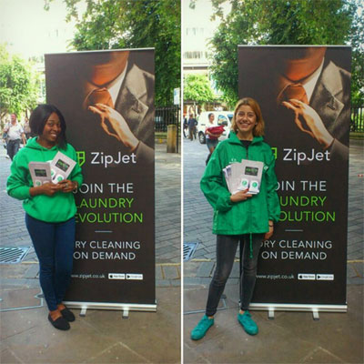
If you’re going to include images of people, resist the temptation to include those bland smiling stock photos models. Such images have been so overused that, to many, they now scream “lazy” and “corporate”.
In practice, this essentially means that rather than attending the exhibition with the intention of promoting your entire business, you instead attend with the intention of promoting one core product or service.
And rather than targeting every single delegate as a potential lead, you instead take the time to define a persona for your ideal lead.
This sort of preparation can feed directly into your banner design. The images and message can focus upon a single product or service, and the words can be written in the sort of language that you know will resonate with your key personae.
You can’t talk to everyone at an event. Many people might wander past your stand fully intending to pay you a visit, but never quite getting round to doing so.
But if you put your contact details on your banner – your website, a contact phone number, and perhaps an email address – they’ll be able to look you up later, at their leisure.
And if you’re on social media, put your Twitter handle and Facebook address there too.
Remember what we said earlier about how people process information? Most people will expect to see contact details at the foot of your display banners. So that’s where you should put them.
For more information about banner design, or for some general advice on making your event a success, why not get in touch? Give us a call on 0116 255 4640, or email sales@ral-display.co.uk.